Layout principles
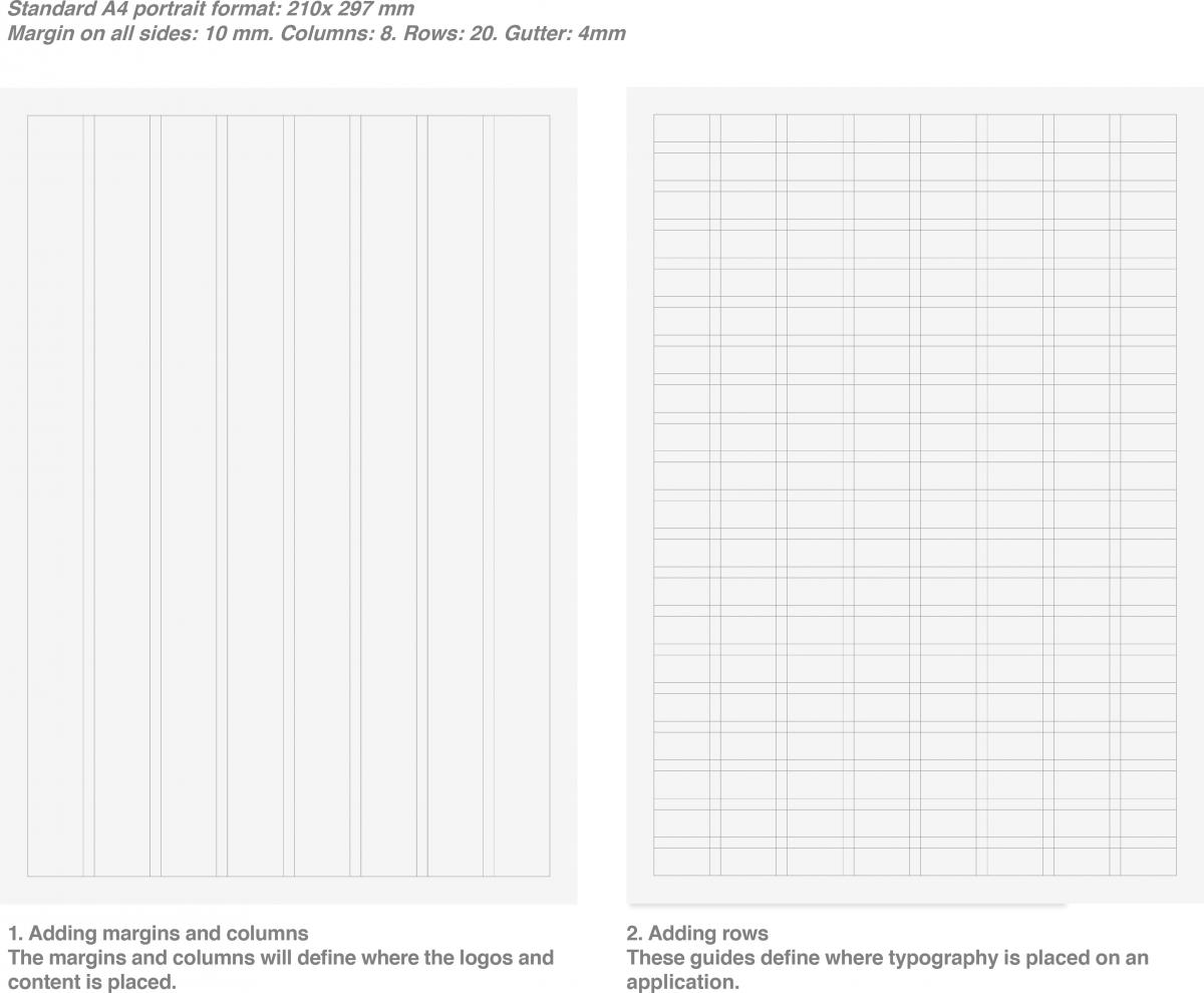
There a five basic grid principles when producing printed materials:
Basic layout principles
-
Proximity: this is about using visual space to show different relationships within content. Related items should be grouped together.
-
White space: it is important to have white space in every composition. These are the areas to breath where no design elements in.
-
Alignment: a navigation through various visual elements is needed.
-
Contrast: make use of graphics and key brand elements such as colors, shapes, etc.
-
Repetition: this is a key aspect for a consistent look and feel throughout various materials.
Grid elements
-
Margin: free surfaces in the layout.
-
Columns: column grid helps you to organise the design elements.
-
Rows: defines where typography is placed on an application.
-
Gutter: space between columns.
Layout principles
Download:
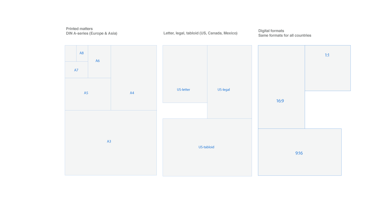
Format / Sizes
Download:
Reports & documents
The recommended paper size is A4. Below you see an example of a two column and a three column mockup:
Download:
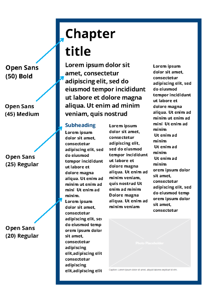
A4 3 columns
Download:
Factsheets
Front cover page: The factsheet cover page is to be solely used to display the title of the Factsheet and graphic element (artwork). The cover artwork should represent one or a combination of: 1) abstract representation of an OSCE activity, 2) work of the OSCE staff on the ground 3) a host country landmark or local aspect of the field operation.
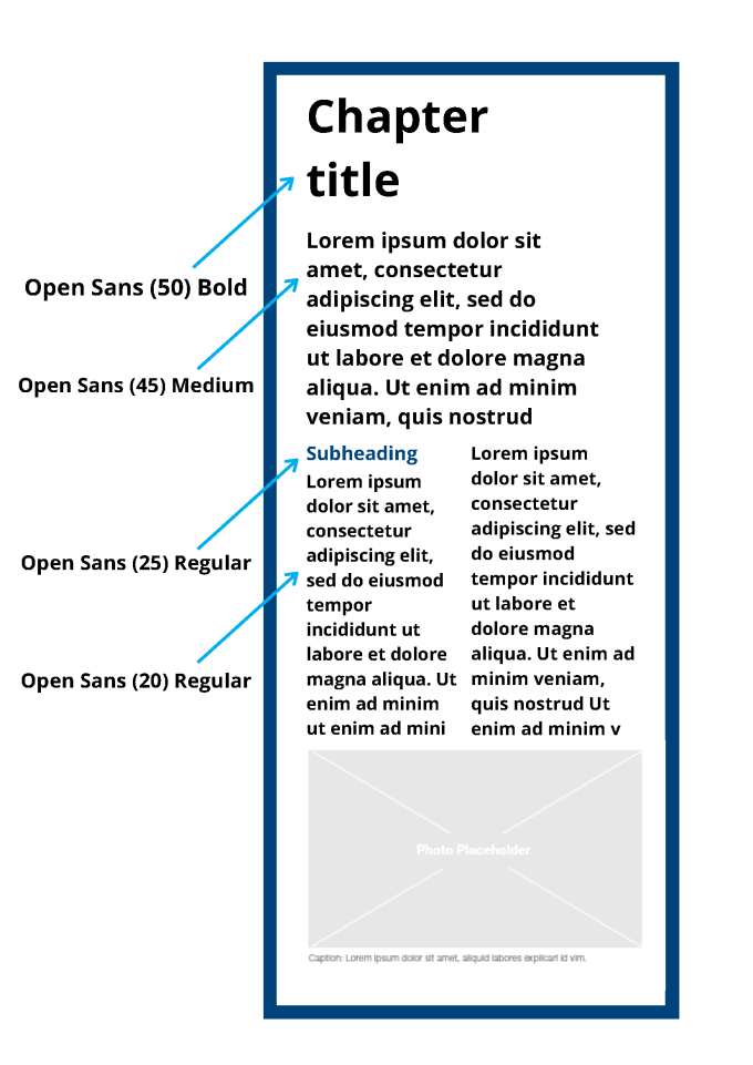
Layout: The factsheet template is based on a 4-column layout. Depending on the length of the text, the size of the photos and texts should be adjusted to preserve the 4-column layout.
Color scheme: The factsheet is based on a two color scheme (primary and accent color) in addition to the black color for body text.
There are a set of rules and guidelines for creating an OSCE Factsheet
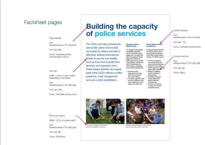
Factsheet pages
Download:
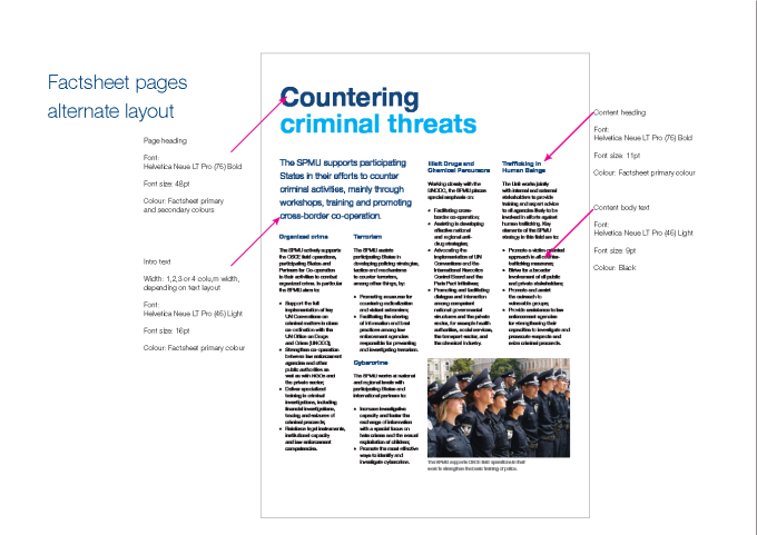
Factsheet pages
Download:
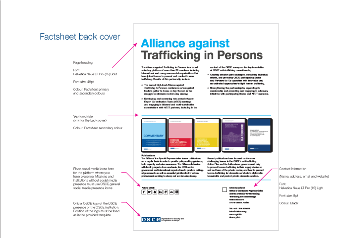
Factsheet back cover
Download:
For further support or questions, contact comms-online@osce.org.
Flyer / Handout
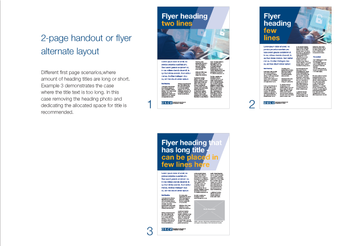
The handout or flyers contain the same structure as the factsheets
Download:
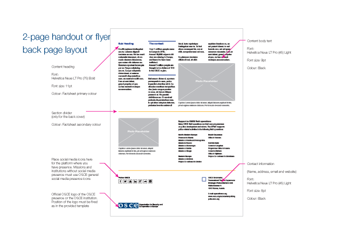
Handout back page
Download:
For further support, contact comms-online@osce.org.
